SNAPSHOT
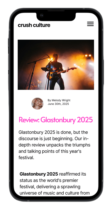
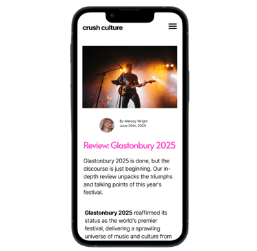
In a digital landscape saturated with music and arts blogs, the purpose of crush culture was to stand out from the mainstream noise. My core assignment was to create a modern, visually compelling website and a comprehensive style guide that would resonate with a discerning audience.
I catered the project to a crowd with a taste for influential culture blogs, building a brand from the ground up that was both authentic and fresh.
UI Design
UX Writing

PROCESS
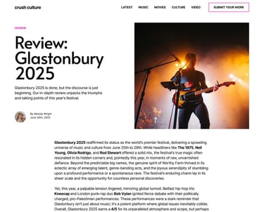
My process began with a deep dive into the essence of the brand. I knew the design had to resonate with a discerning audience that values authenticity and modern aesthetics.
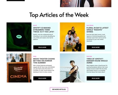
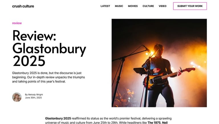
My first goal was to ensure the user interface was easy to read and navigate. I designed the typography and layout to be clean and simple, putting the focus squarely on the content (the interviews, reviews, and articles themselves). To keep the experience from being bland, I made a conscious choice to infuse the UI with splashes of artificial color.
This bold color palette was used to highlight key elements and evoke a sense of rebellious energy, setting the brand apart from typical, muted blogs. The result is a user experience that feels both effortlessly usable and unapologetically modern.


REFLECTION
This project was a valuable exercise in managing a large-scale design system. It underscored the importance of a well-organized style guide, where managing a large number of components — from typography and color palettes to button styles and card layouts — was critical to maintaining a cohesive design.
Furthermore, the project provided a great opportunity to hone my skills in curating compelling copy, ensuring the content was as dynamic and engaging as the UI itself. The result is a modern, responsive website that effectively balances bold visuals with a refined and effortless user experience.


