
SNAPSHOT
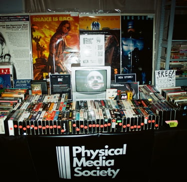
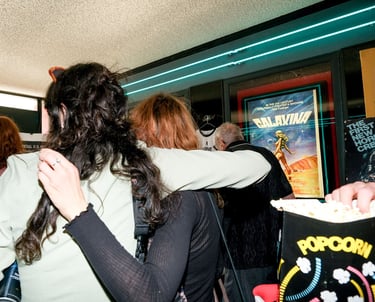
In an age of streaming-first convenience, a new community was needed to champion the art and culture of physical media. Physical Media Society was born from this mission a brand dedicated to celebrating and preserving film and music in their tangible forms.
The challenge was to create a brand identity that was both authentic to its roots and compelling enough to resonate with modern audiences, drawing in a passionate community and industry tastemakers alike.
Creative Direction
Branding
PROBLEM
In a market saturated with niche collector groups, the challenge was to create a brand that reached a wider audience. I wanted to tap into a powerful emotional connection: nostalgia for physical media formats.
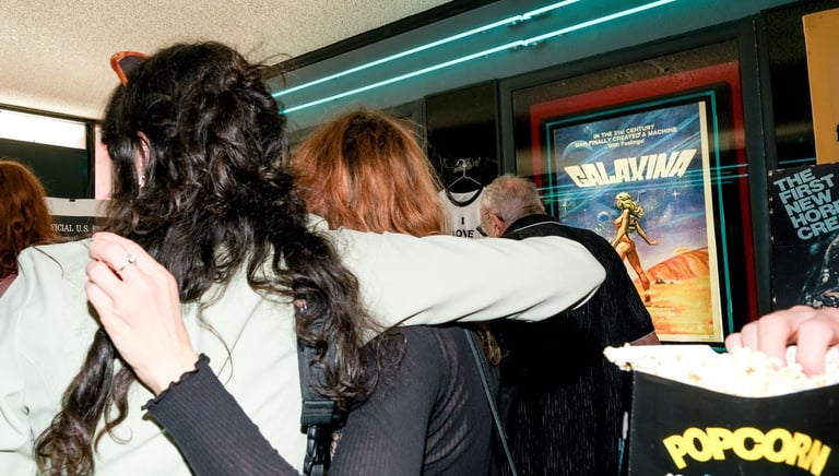
The goal wasn't just about selling physical media, but about honoring the shared experience of growing up with these objects. The brand needed to create a sense of community and, in doing so, build a sustainable organization to fund its mission.


PROCESS
With the mission to connect with those who held an emotional attachment to physical media, the design process focused on evoking a sense of heritage and authenticity.
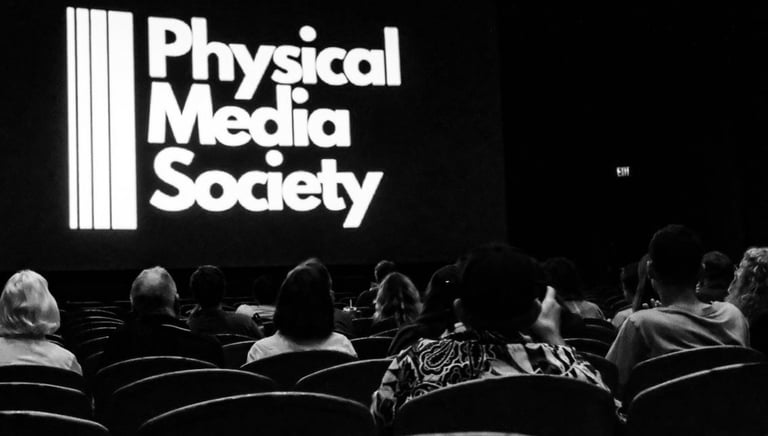
My first step was to select a typeface that felt like it had been part of the cinematic landscape since the '70s. I chose League Gothic for its condensed, bold presence, which instantly recalls the classic title cards and posters from the heydey of 35mm film.
Next, I focused on a logo that would subtly communicate the brand's broad scope beyond just one format. In its design, each line represents a different physical media format: tape (VHS), 16mm, 35mm, and 70mm.
This simple visual element was key to showcasing that the society celebrates a wide range of formats, not just a single one.


SOLUTION
The solution was a brand identity so clear in its purpose that it acted as its own best advocate. By blending nostalgic aesthetics with intentional design, the brand immediately resonated with its target audience.
The name serves as a powerful mission statement, drawing the attention of key industry figures who recognized its resonance.
This clarity directly led to a feature on LAist NPR, where a reporter was intrigued by the logo on a flyer. The word "Society" proved to be a critical element, evoking a sense of community and intellectual curiosity.
The design's authenticity and mission-driven approach attracted attention from influential advocates like Oscar-Winning Writer/Director Sean Baker, Patton Oswalt, and esteemed institutions such as TCL Chinese Theatre, BeyondFest and the American Cinematheque.
The success of the brand demonstrates that in a world of digital bombardment, a well-crafted brand can be the catalyst for a powerful connection.
REFLECTION
This project underscored a vital lesson: a brand name doesn't need to be trendy to be captivating.
The initial success of the Physical Media Society proved that a name which clearly states its mission is more valuable than one that is merely clever. However, with the benefit of hindsight, I would have considered shortening the name to improve its memorability.
I also learned that a brand's visual identity must be as clear as its name. Our existing color palette, while classic, lacks a single, most recognizable color. Moving forward, I would develop a consistent, bold color scheme to become synonymous with the brand.
This project taught me that successful branding isn't about being the loudest voice in the room, but about being the most authentic one.

