
SNAPSHOT
In the crowded meditation and wellness app market, finding a unique niche is key to standing out. Wisp was designed to be a sanctuary for those seeking calm through ASMR, a specific auditory experience that can induce deep relaxation.
The challenge was to define the brand's identity and user experience from the ground up by developing two distinct creative directions. This project was a deep dive into visual storytelling, with the goal of translating a subtle, sensory experience into a compelling and functional app.
UX/UI Design
Creative Direction
PROBLEM
The challenge was to translate the subtle, calming sensation of ASMR into a tangible, digital experience. Given a blank slate with only a logo, the project was a test of creative vision and strategic branding.
The core problem was twofold: first, to define the essence of a brand focused on a sensory experience, and second, to present two distinct creative directions that could each stand on their own. This required a deep dive into visual language and emotional design to create a foundation for an app that could truly resonate with users seeking a specific form of relaxation.

PROCESS
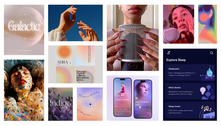
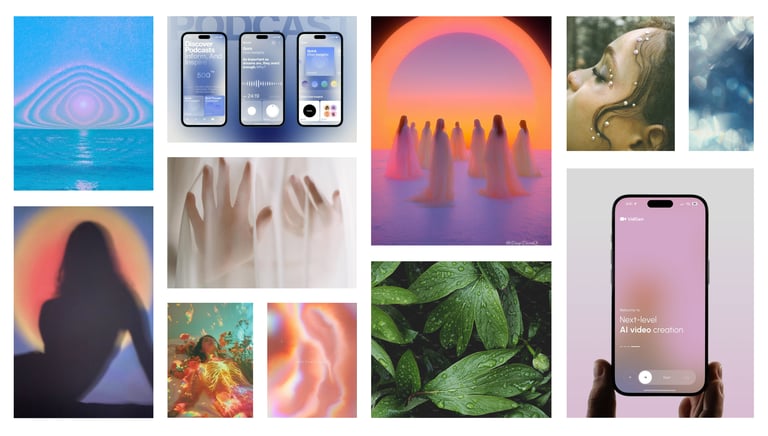
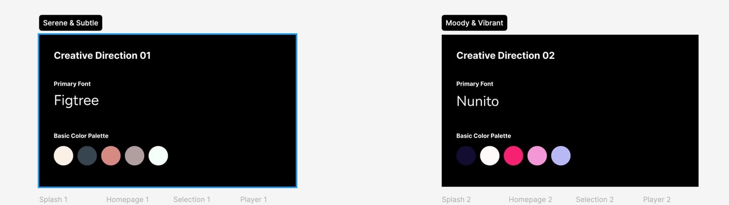
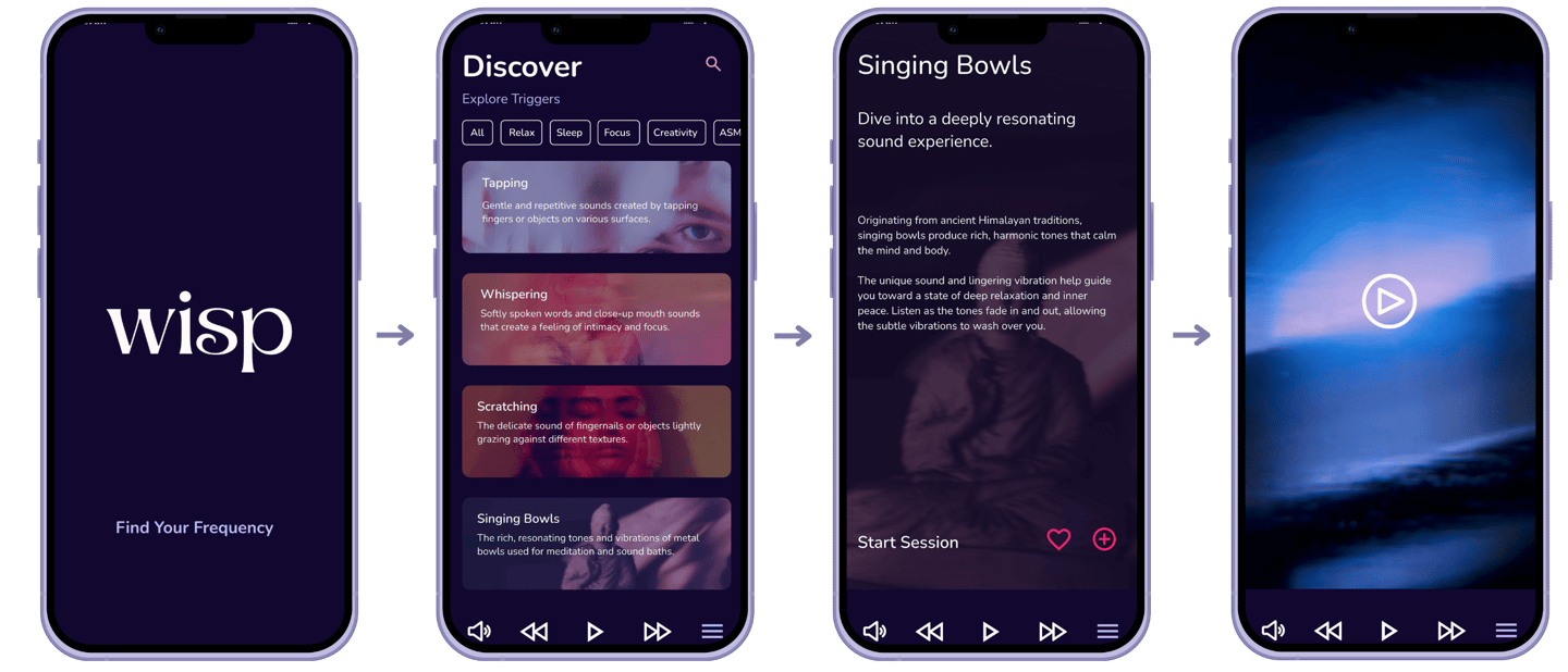
Given a blank slate, my process began by translating a subtle, sensory experience into two distinct visual narratives. I started by creating a mood board to capture an ethereal energy that would inform both creative directions.
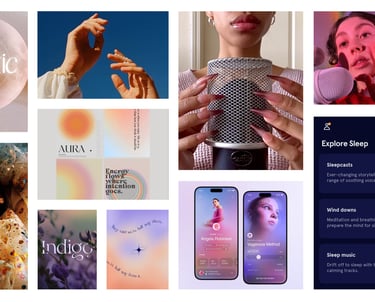
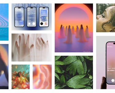
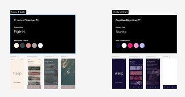
The first concept, "Serene & Subtle," was designed with a more naturalistic and airy aesthetic in mind, using soft gradients and organic imagery. The second concept, "Moody & Vibrant," took a bold and contemporary approach, using deep purples and vibrant accents to evoke an edgy feel that suits the nighttime.
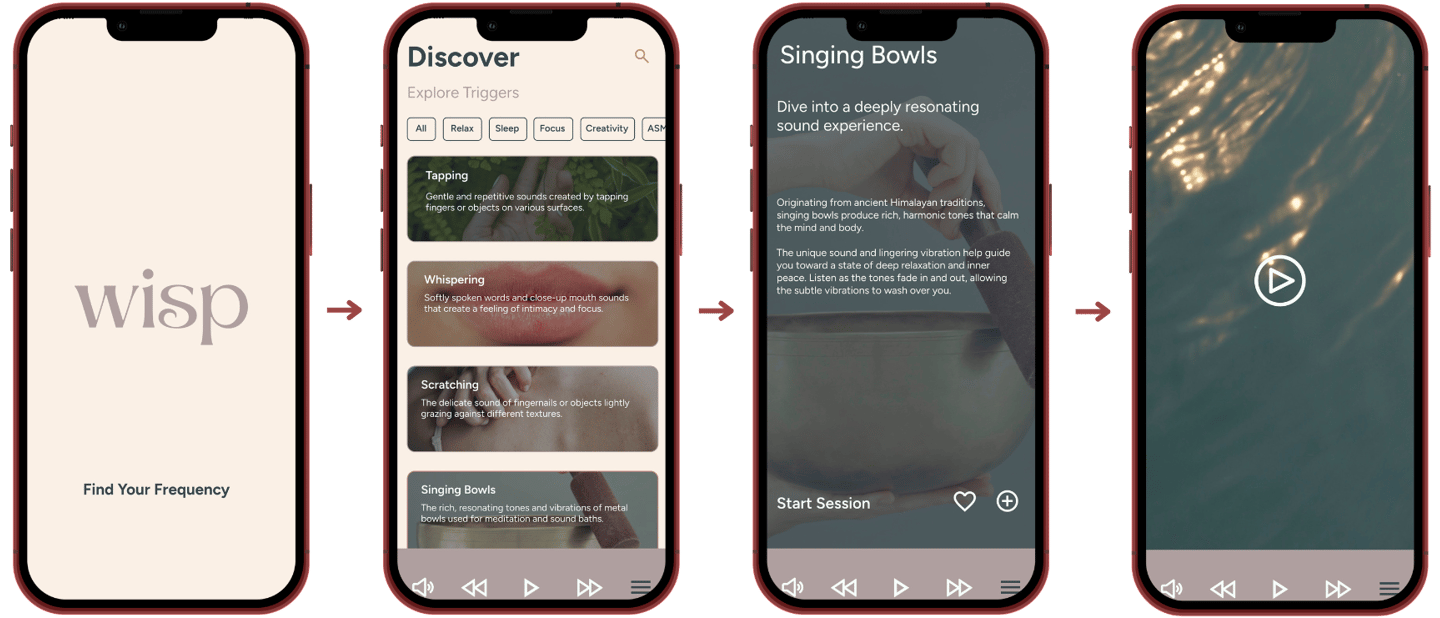
After developing low-fidelity prototypes for both concepts, I moved forward with the "Moody & Vibrant" direction for the final high-fidelity prototype. This decision allowed me to fully explore the potential of a unique, modern aesthetic that sets the app apart in the wellness space.


RESULTS
This project was a crucial lesson in creative interpretation and the impact of user context on design.
I learned that a single concept, such as "ethereal," can have many different visual interpretations. The exercise of developing two distinct directions underscored the importance of translating a feeling into a functional design. Ultimately, the creative direction was influenced by a simple, yet powerful, factor: the time of day a user would most likely engage with the app.
I am very proud of the final selection, as it not only represents the more unique and bold aesthetic but also makes more functional sense for a user seeking a quiet moment at the end of their day. The outcome is a high-fidelity prototype that is both visually compelling and intuitively designed.

